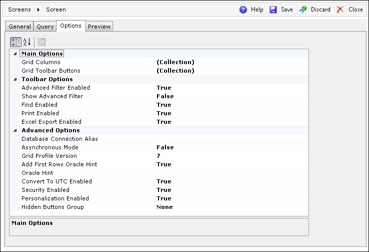
This tab includes a comprehensive set of options that make it possible to configure a screen according to user-specific requirements. The tab is divided into three sections:
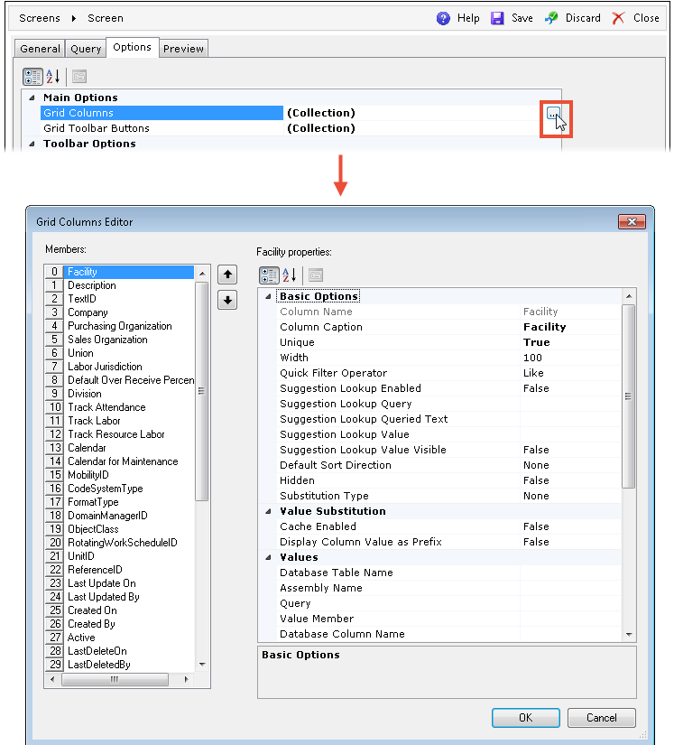
| Field | Description |
| Column Name | The name of the column as defined in the query. |
| Column Caption | The column's heading to be displayed on the screen. |
| Unique | If True, every row in this column must always contain different values. At least one unique column is required to enable paging. |
| Width | The horizontal size of the column. |
| Quick Filter Operator | Specifies the way the Quick Filter is applied. The available
operators are:
|
| Suggestion Lookup Enabled | Enables the Suggestion Lookup for the Quick Filter. Can be enabled only for String and Integer columns. |
| Suggestion Lookup Query | The user-defined query that should return two columns: the value column and the text to be searched. |
| Suggestion Lookup Queried Text | The text column to describe the value on the grid. |
| Suggestion Lookup Value | The name of the value column. The value column results must be unique. |
| Suggestion Lookup Value Visible | Specifies if the value column should be visible in the Suggestion Lookup. |
| Default Sort Direction | The default way in which records are sorted in the column. |
| Hidden | Specifies if the column should be invisible to the user. |
| Substitution Type | The way the column values are replaced on the grid. The possible
choices are:
|
If the Personalization Enabled option is set to True on the Options tab, then the grid columns settings such as Width, Default Sort Direction, and Hidden are overridden by the settings applied in the user profile.
| Field | Description |
| Cache Enabled | If True, the values for substitution are not refreshed each time the grid is populated. |
| Display Column Value as Prefix | Displays the actual column value next to the description. |
| Field | Description | |
| Text_Translation | Database Table Name | The database table name containing the values used for substitution. The table should contain a column with the values and the TextID column. |
| Database Column Name | The name of the column containing the dictionary of values intended for substitution. | |
| Display Member | Specifies the description column from the TEXT_TRANSLATION table to be displayed. The available description columns are: Short, Medium, Extended. | |
| Enum | Assembly Name | The name of the assembly containing the values intended for substitution. |
| Class Name | Defines the class in the assembly containing the values intended for substitution. | |
| Display Member | Specifies the description column/property to be displayed. | |
| Query | Query | The user-defined query which returns two columns: the value column and the text to display. |
| Value Member | The name of the value column. | |
| Display Member | The text column to describe the value on the grid. | |
| Discrete | Value List | Opens an editor for defining the ad-hoc values and descriptions for substitution. |
| None | The value substitution is disabled. | |
| Field | Description |
| Always Visible | Specifies if the column should always be displayed to the user. |
| Case Sensitive | If True, the column will recognize upper- and lower-case letters. |
| Row Grouping Block | Specifies the grouping block to which the column belongs and
defines how the rows will be grouped. This can consist of one
or more columns.
Columns assigned to the Row Grouping Block should not contain NULL values, as NULL values will be ignored by a JOIN statement. Rows with a NULL value in one of the Row Grouping Block columns will not be returned. |
| Required | When a column must be returned by the query, this option validates the query. |
| Locatable | Used for going to the desired row by entering text in the column header (for the Char and LongChar data types). |
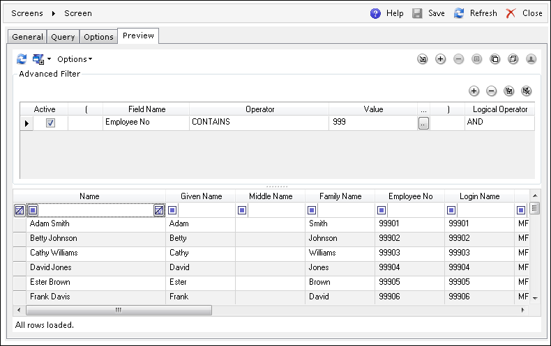
| Searchable | This option enables searching with use of the Advanced Filter. |
| Sortable | Enables sorting the grid by alphabetic (or reverse-alphabetic) order of the column's rows. |
| Data Type | Defines the value type stored in the column. The available data types are: Char, Integer, Decimal, Boolean, DateTime, Date, LongChar. |
| Decimal Format | Specifies how decimal values should be formatted (e.g., if set to 0.00, a value like 1.2345 will be displayed as 1.23). For more information on custom formatting, refer to Custom numeric format strings article at Microsoft Docs. |
| Decimal Alignment | Specifies whether the decimal values are aligned to the left or right. |
| Default Profile Visible | If True, the column will be displayed in the default profile. |
| External Column | If True, the column may be used in the filter when opening the grid from another grid. If the Searchable field is set to False, then this column will not be used in the filter. |
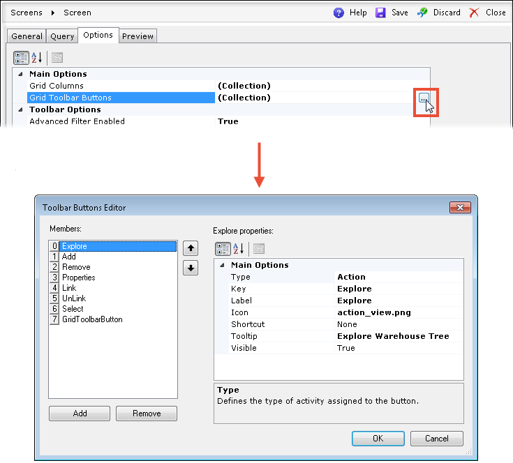
| Field | Description |
| Type | Defines the type of button. The available types are: Action,
StandardOperation, Grid, Editor, and MultiEditor.
The StandardOperation and Grid types have additional configuration options on the selection window. For more details, refer to the Selection Window section in Properties (Linkable Action Properties) below. |
| Key | Specifies the unique name of the button. When choosing Action in the Type field, a proper value must be specified here to invoke the desired function. |
| Label | Specifies the description to be displayed next to the button. |
| Icon | Enables choosing an image for the button from the server. |
| Shortcut | Assigns a keyboard shortcut to the button. |
| Tooltip | Specifies the description to be displayed after the user hovers the mouse pointer over the button. |
| Visible | If set to False, the button will be hidden to the user. |
| Field | Description | ||
| Action Properties | (The properties are disabled) | ||
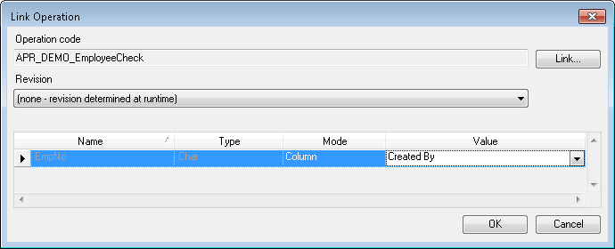
| StandardOperation | Selection Window (Link Operation) |
|
|
| Availability Mode | Defines the relationship between the button and the selection.
The available modes are:
|
||
| Display Mode | Specifies the way the Standard Operation is displayed. The
available modes are:
|
||
| Disable Popup Close Button | When set to True, the user will not be able to close a Standard
Operation opened from a Dynamic Browser by using the standard
Windows close button ( ).
This setting is available only when theDisplay
Mode is set to Popup. ).
This setting is available only when theDisplay
Mode is set to Popup. |
||
| Refreshing Mode | Specifies the way that the grid is refreshed after the execution of a Standard Operation. The available modes are: None, SelectedRowsOnly, AllRows. | ||
| Asynchronous Mode | Enables running in background by Job Executor. | ||
| Confirmation | Enables asking for confirmation before running an Operation. | ||
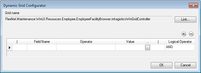
| Grid | Selection Window (Dynamic Grid Configurator) |
|
|
| Availability Mode | Defines the relationship between the button and the selection.
The available modes are:
|
||
| Specifies the way the grid is displayed. The available modes are: NewTab, Popup. | |||
| Specifies the way the grid is refreshed. The available modes are: None, SelectedRowsOnly, AllRows. | |||
| Browser State | Defines how the grid will be launched:
|
||
| Browser
Options |
HiddenButtonsGroup | Defines the button group to be invisible to the user. The available button groups are: None, Selection, Edit, Custom. | |
| MultiSelector | Specifies if multi-selection should be available on the grid. | ||
| PersonalizationContext | The name of the personalization profile's context used by other DELMIA Apriso modules. | ||
| Editor | Availability Mode | Defines the relationship between the button and selection. The available modes are: Always, SingleRowOnly, MultipleRows. For more details, see the Standard Operation's Availability Modes. | |
| Display Mode | Specifies the way the editor is displayed. The available modes are: NewTab, Popup. | ||
| Refreshing Mode | Specifies the way the grid is refreshed. The available modes are: None, SelectedRowsOnly, AllRows. | ||
| Editor Mode | Defines if the editor should be run for a new row (empty) or for an existing one (populated with existing values). The available modes are: New, Edit. | ||
| MultiEditor | Availability Mode | Defines the relationship between the button and selection. The available modes are: Always, SingleRowOnly, MultipleRows. For more details, see the Standard Operation's Availability Modes. | |
| Display Mode | Specifies the way the MultiEditor is displayed. The available modes are: NewTab, Popup. | ||
| Refreshing Mode | Specifies the way the grid is refreshed. The available modes are: None, SelectedRowsOnly, AllRows. | ||
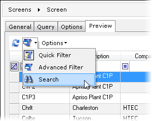
This option specifies if the Advanced Filter functionality should be enabled in the screen's filter drop-down menu.
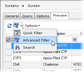
This option specifies if the Advanced Filter section should be displayed on the screen.
This option specifies if the Search option should be available from the screen's filter drop-down menu.
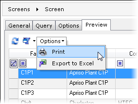
This option defines if printing (using a local printer) should be available from the screen's Options drop-down menu.
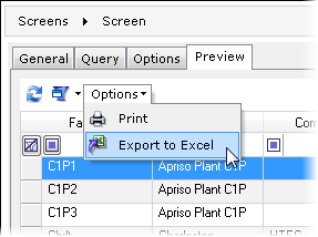
This option specifies if the exporting to the Excel format should be available from the screen's Options drop-down menu.
| Field | Description |
| Database Connection Alias | Allows the user to choose between the databases previously configured in DELMIA Apriso Configuration Manager. |
| Asynchronous Mode | When set to True, this forces the grid to work in an asynchronous mode, which improves performance with long queries and enables canceling data-loading Operations. |
| Grid Profile Version | The version of grid profile to be used. Increase this number to create new profiles. |
| Add First Rows Oracle Hint | Enables the Oracle First Row Hint for a faster screen load. |
| Oracle Hint | A user-defined Oracle hint that can be defined for time-consuming queries. |
| Convert to UTC Enabled | Specifies if the displayed time should be calculated to reflect the Coordinated Universal Time. |
| Security Enabled | Defines if the Security settings of a Dynamic List should be taken into consideration. |
| Personalization Enabled | Specifies if the personalization described in the Browser Personalization should be applied and available on the screen. |
| Hidden Buttons Group | Defines if any group of buttons should be made invisible to the user. The available button groups are: None, Selection, Edit, Custom. |
 (Add) and
  (Remove) respectively